As a symbol of nature, growth and harmony, green has accompanied mankind through ages and cultures, enriching art, fashion and design with a wide range of shades. From the oldest shades to those recently discovered, we explore some of the most significant shades of green in history.
- The perception of green: an evolutionary skill
- Mankind’s first green pigments
- Malachite green: the first green pigment used by homo sapiens
- A Renaissance discovery: Veronese green
- Paris green: beautiful and toxic
- The ‘fastest’: British racing green
- The green Islam
- The celadon green of oriental ceramics
- Olive green
- Sage green
- The other ‘vegetable’ greens: grass, fern, forest, lime, moss, olive, pine, pea, pistachio, clover
- The ‘ambiguous’ colours between green and blue: aquamarine, teal and petrol green
- Marrs green: the most beautiful colour in the world?
- Lattementa: a pastel green designed by Rio Verde
The perception of green: an evolutionary skill
The colour green occupies a central position in the visible spectrum, with wavelengths between approximately 520 and 565 nanometres. This range places it between blue and yellow, making it particularly prominent in natural light reflected by vegetation.
Human eyes are extraordinarily sensitive to green due to the presence of three types of cones in the retina, one of which is particularly dedicated to this colour. This sensitivity is an evolutionary matter: for our ancestors, recognising different shades of green was crucial for distinguishing between edible leaves, ripe fruit and potential dangers hidden in vegetation. Consequently, today we can perceive more shades of green than any other colour, an ability that continues to influence design and art.
Goethe wrote in his famous Theory of Colours: ‘If we combine yellow and blue, which we consider the first and simplest colours, we obtain the colour we call green. In it our eye finds true fulfilment. If both mother colours are perfectly balanced in the compound, so that one is not noticed before the other, eye and soul rest on this compound. This is why green is usually chosen for the upholstery of living rooms’.
Mankind’s first green pigments
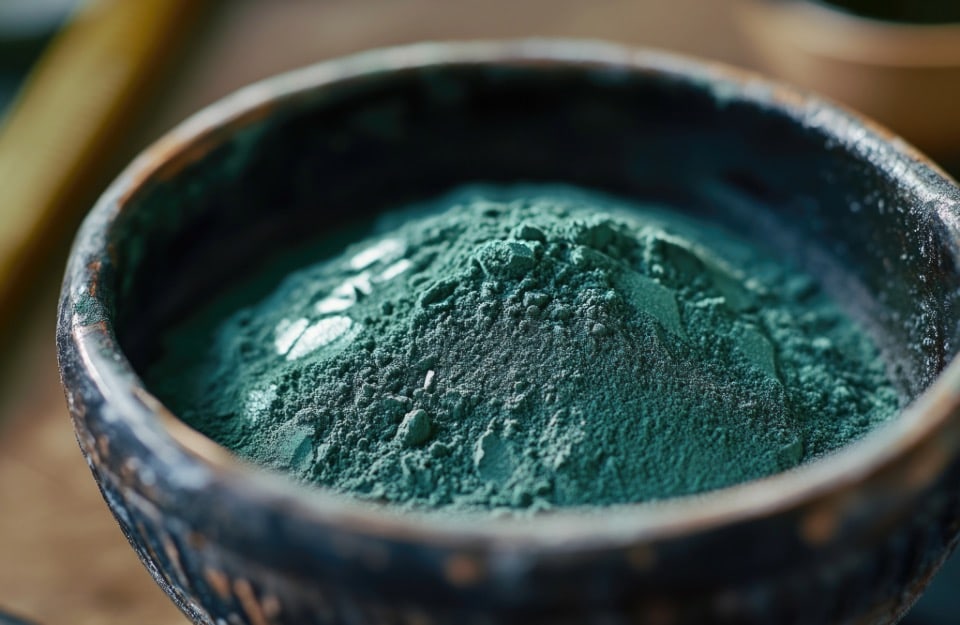
The green pigments used by our ancestors were mainly derived from natural materials such as minerals and plants. Malachite, a copper-rich mineral, was ground to obtain an intense green pigment. Other common materials included ground leaves or oxide-rich soils. These pigments were often difficult to work with, as they tended to fade or react with other materials. Nevertheless, they were used to decorate artefacts, cave paintings and ceramics, as well as for dyeing textiles.
In ancient Egypt, green represented fertility, life and rebirth. The Romans associated it with the goddess Venus and symbolised prosperity and abundance. In the Middle Ages, the meanings became more ambiguous, and this colour also became linked to illness, evil and – due to its mutability (it tended to fade in textiles) – to everything that is fickle and destined not to last.
In some Oriental languages and cultures, such as Japanese, Mandarin and Vietnamese, green is considered a shade of blue.
Malachite green: the first green pigment used by homo sapiens
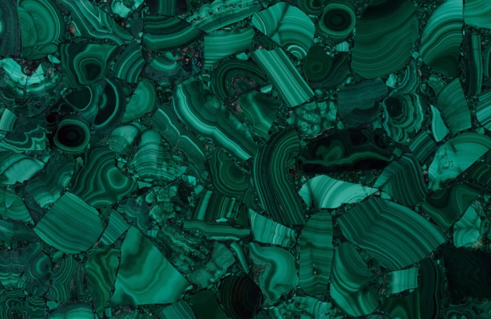
Malachite, a copper mineral with a characteristic deep green colour, has been used as a pigment since ancient times. Traces of it can already be found in cave paintings dating back to prehistoric times.
The ancient Egyptians used this mineral to make amulets (a custom that also spread to the Greeks and Romans) and used the pigment for wall paintings as well as make-up.
Renaissance artists ground it finely to obtain a bright green powder, used in paintings and frescoes.
A Renaissance discovery: Veronese green
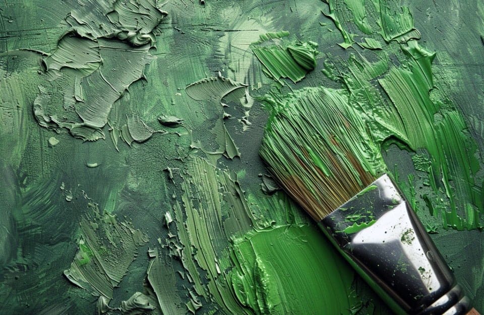
Veronese green owes its name to the Renaissance painter Paolo Veronese, who used it frequently in his works and is considered its discoverer.
It is a synthetic inorganic pigment, based on hydrated chromium oxide.
Paris Green: beautiful and toxic
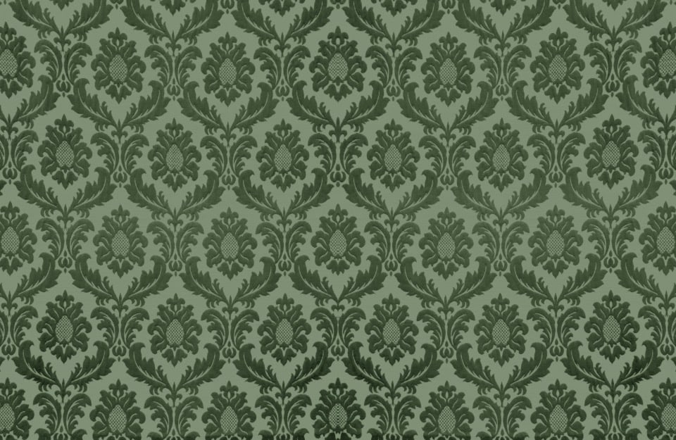
Invented at the turn of the 18th and 19th centuries, Paris green is a synthetic inorganic pigment. It is a basic acetate of copper arsenite. Due to the presence of arsenic, it is extremely toxic, so much so that it owes its name to the fact that in the 19th century it was used to kill rats infesting Parisian sewers.
It is also known by many other names, including Schweinfurt Green, Basel Green, Leipzig Green, and Vienna Green.
Despite its dangerousness, it was used for a long time in painting (at least until the 1960s) and especially in the production of wallpaper and other products, causing quite a few cases of poisoning.
Today, it is banned in almost all areas.
The ‘fastest’: British racing green

British Racing Green – known to us as ‘British racing green’ or more simply ‘British green‘ – was born at the beginning of the 20th century, when the car became a means of competition. In 1903, during the Gordon Bennett Cup, by rule each nation had to compete with cars painted in a representative colour. The United Kingdom chose dark green, which has since remained associated with some famous British car brands such as Bentley, Jaguar, Aston Martin and Lotus.
Green Islam
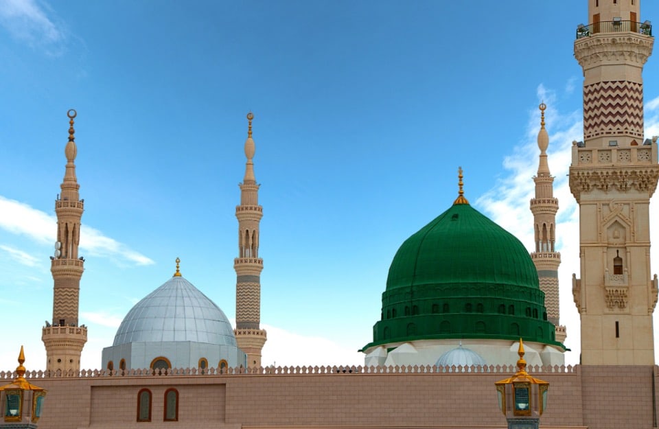
Used in almost all the flags of Muslim countries, the so-called ‘Islam green‘ originates from the tribe of Muhammad, who used this colour – symbolising paradise – for his banner.
There is also a variant, Persian green, similar to malachite, characteristic of Persia and widely used in traditional ceramics.
The celadon green of oriental ceramics
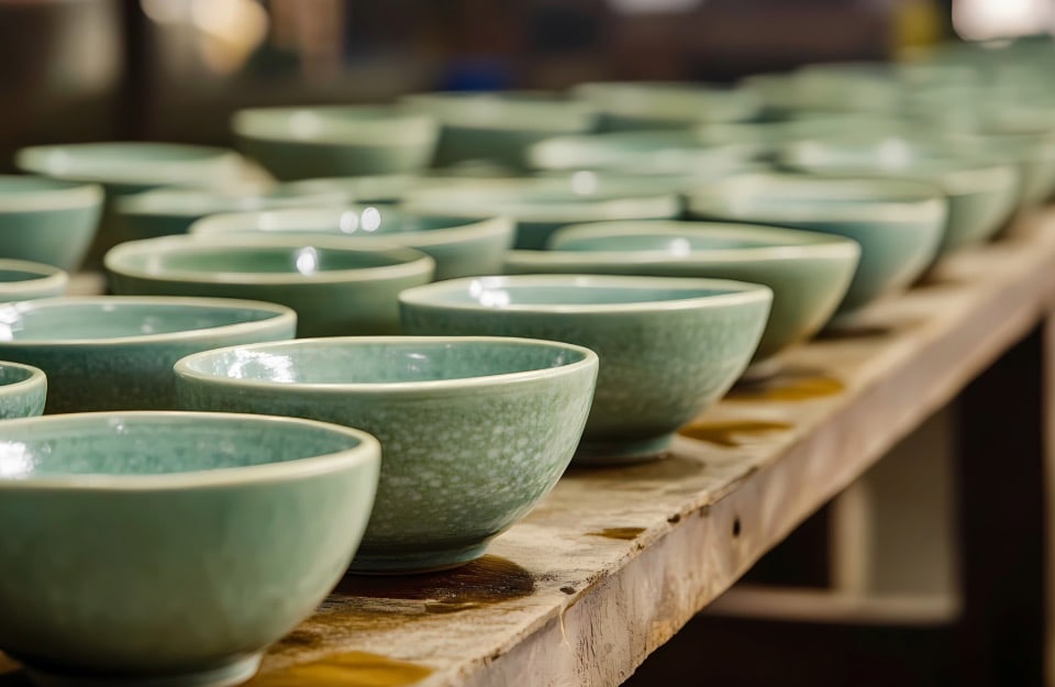
For more than a millennium, splendid ceramics have been produced in China and Korea that are characterised by a pale green-grey colour, produced by small quantities of iron oxide that are released during firing.
That green, in France in the 17th century, was named after a character in a pastoral novel(L’Astrea) who wore a robe of the same hue – Celadon, in fact – and has been called that ever since.
Olive green

Very fashionable in interior design and fashion in recent years, olive green (about which we have spoken more extensively here) is a yellowish-green reminiscent of the colour of ripe olives.
It is often synonymous with military green.
Sage green
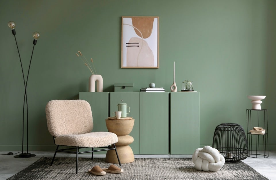
Also very trendy, sage green is a dusty green-grey reminiscent of the leaves of sage plants.
The other ‘vegetable’ greens: grass, fern, forest, lime, moss…
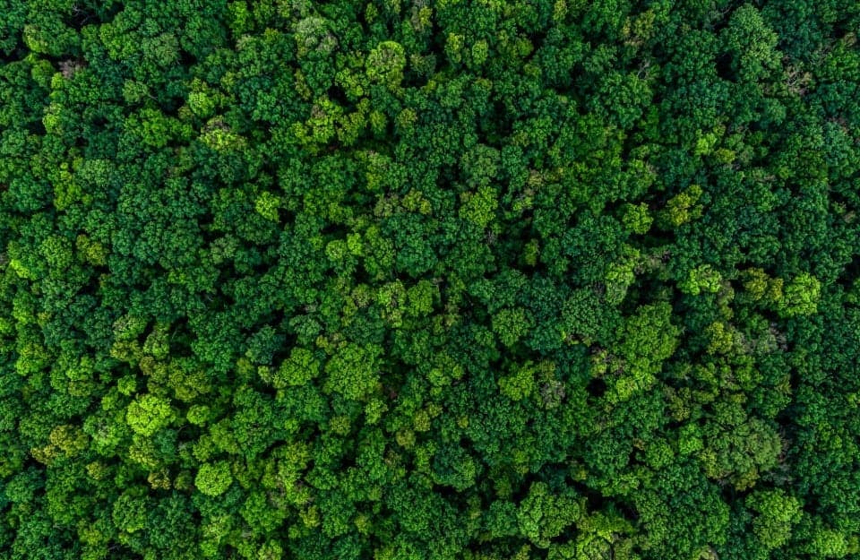
Of course, many of the names of greens are botanically inspired.
These include:
- grass green: an intense shade;
- fern: darker and less saturated than grass green, it is also the same shade used in the Italian tricolour;
- forest: slightly darker than grass green, it represents the average leaf shade that can be found in a temperate zone forest;
- lime green: also very intense, it takes its name from the peel of the citrus fruit of the same name;
- moss green: is very light and has a hint of grey;
- olive green: is similar to olive green but with less yellow;
- pine green: dark and intense, reminiscent of the colour of a coniferous forest;
- pea green: light and intense. It is reminiscent of the legume of the same name;
- pistachio: is a medium-light shade with a hint of yellow;
- shamrock: this is the one used on the flag of Ireland and for the traditional St Patrick’s Day celebration.
The ‘ambiguous’ colours between green and blue: aquamarine, teal and petrol green

Colours that lie between green and blue, such as aquamarine, teal and petrol green, are ambiguous and fascinating shades. These shades catch the eye because of their ability to evoke both the depth of blue and the vitality of green, often appearing mysterious and sophisticated.
- Aquamarine (or aqua green) is a light colour between green and cyan. It takes its name from the mineral of the same name, itself so called because it is reminiscent of the shades of sea water.
- Ottanio: is a dark shade that perfectly balances green and blue, with a touch of grey that makes it sophisticated and versatile. It is a shade that originated in the 1950s from the combination of turquoise with petrol green.
- Petrol green: this is a dark, intense shade that mixes green and blue with grey accents, being closer to green than to teal. It has gained popularity in interior design and fashion since the 1980s due to its versatility.
Marrs green: the most beautiful colour in the world?
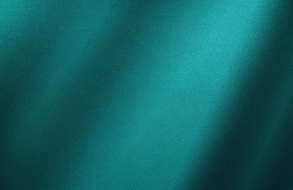
In 2017, the British paper company G . F Smith launched a poll on a global scale, asking people to select their favourite colour on a colour scale that contained them all. The majority of votes ended up in the range of greens and blues and, from the average of the results, a blue-green was chosen as the “most beautiful colour”, which was then named Marrs green in honour of the participant who came closest: one Annie Marrs, a Scottish woman who, in her choice, said she was inspired by the waters of the River Tay, the largest in Scotland, and the surrounding nature.
Lattementa: a pastel green designed by Rio Verde
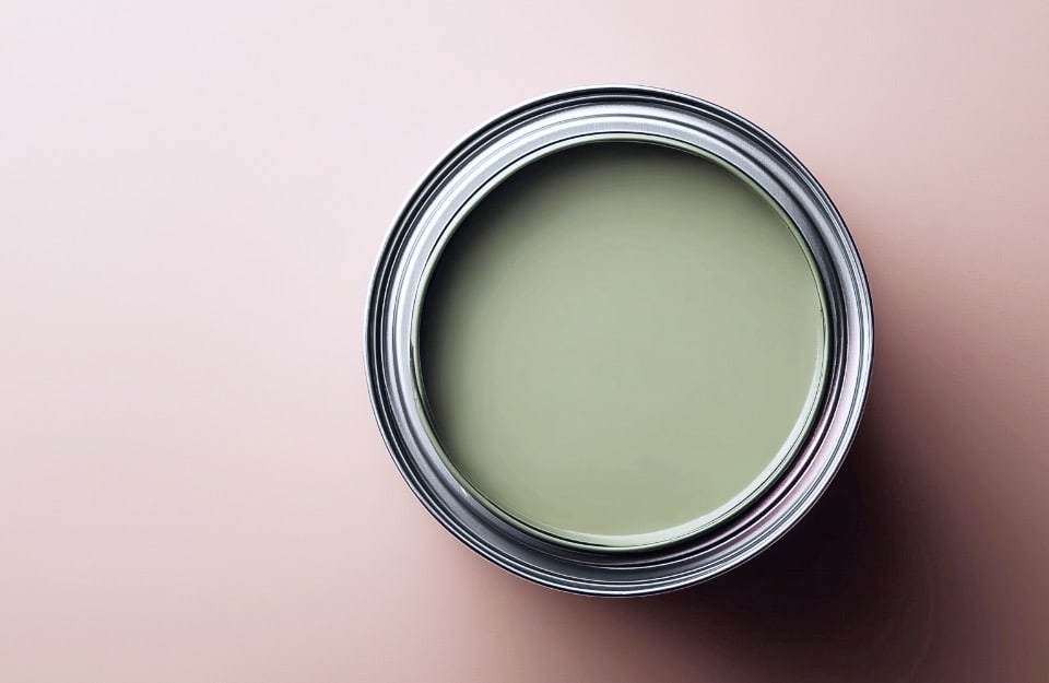
In Rio Verde’s Vintage Prestige line of water-based paints for interior and exterior use, all colour combinations of green can be achieved. But there is one in particular that is part of the ready-made colour palette. It is lattementa: a very trendy pastel green that can be applied to many materials: wood, metal, glass, plastic, fabric and small portions of wall.

