The choice of PANTONE 17-1230 Mocha Mousse as Colour of the Year 2025 came as no great surprise. Indeed, neutral, warm and earthy colours have long dominated trends, especially in interior design, but also in fashion, branding and other creative fields. These shades reflect a collective desire for comfort, authenticity and connection with nature, responding to the aesthetic and emotional needs of our time. For 2025, the Pantone Colour Institute has decided to embrace this sensibility with an enveloping shade of brown, inspired by the richness of cocoa, chocolate and coffee. Mocha Mousse is a colour that embodies not only discreet luxury, but also the reassuring warmth we need in an ever-changing world.
The colour of the year 2024 according to Pantone is Mocha Mousse

Every year since 1999, the Pantone Colour Institute, founded by the US company Pantone, selects a colour that can represent the so-called zeitgeist, the spirit of the times, interpreting cultural, social and aesthetic trends.
This is a highly successful marketing move, now imitated by many others, and capable of creating considerable expectation and just as much noise: with each release of the Colour of the Year, it is talked about practically everywhere – among those in the industry and not – and in a short time the market and company catalogues are filled with graphics and products that refer to the chosen shade. What colour is Mocha Mousse?
Described as “authentic and approachable”, this brown embodies the universal desire for moments of personal pleasure.
According to Leatrice Eiseman, Executive Director of the Pantone Color Institute, “sophisticated and lush, yet an unpretentious classic, PANTONE 17-1230 Mocha Mousse extends our perception of browns from being humble and grounded to embracing aspiration and luxury. Infused with subtle elegance and earthy sophistication, PANTONE 17-1230 Mocha Mousse presents a touch of understated, subtle glamour.

A brown that speaks of everyday pleasures
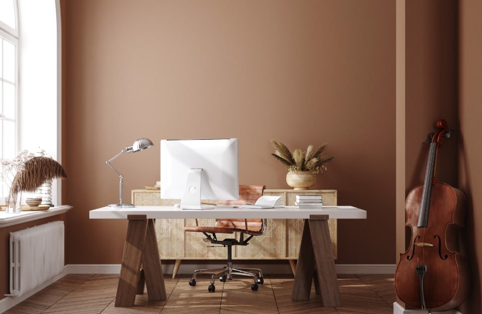
It is a neutral, warm, soft (like a mousse, in fact), cosy shade, which – to quote Pantone – ‘ echoes our desire for comfort and simple pleasures ‘. In anera of rapid change and constant challenges (one only has to look out of the window, metaphorically and literally, to realise this. At all levels: geopolitical, economic, climatic…) the Mocha Mousse is a kind of ‘ chromaticrefuge ‘.Firm, reassuring, and at the same time able to offer a kind of ‘escape’ from everyday worries, in search of those simple yet rich sensations that hark back to familiar ingredients and rituals: the coffee break, the chocolate to be unwrapped like a treasure after a good meal. Without making a fuss, the brown chosen by Pantone also embodies a subtle elegance. It is a neutral colour that can stand out, as well as integrating perfectly within many colour palettes, taking the leading role or simply accompanying, complementing and enhancing other colours.
How to decorate with Mocha Mousse and what colours to match it with
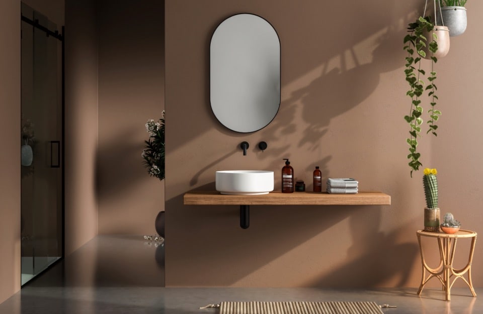
As already mentioned, this brown suits a wide range of palettes, enhancing both minimalist and more elaborate designs. Whether for elegant interiors, sophisticated fashion or eye-catching graphics, this shade strikes the perfect balance between comfort and modernity. Its ability to evoke tactile sensations, scents and flavours such as cocoa and coffee, makes it particularly attractive in interior design, where spaces increasingly want to evoke a sense of welcome and well-being. Among the most fascinating combinations are:
- warm neutralcolours such as beige and cream, or like Hazelnut from Rio Verde ‘s Vintage Prestige paint line . For a soft and relaxing ton-sur-ton effect, ideal in minimalist interiors or cosy atmospheres;
- warmgreys, which add a very contemporary touch, perfect for elegant settings with an almost classical refinement. An example: Marzipan and Truffle from the aforementioned Vintage Prestige;
- blues and dusty greens such as Cornflower or, again in Vintage Prestige, Anise and Lattementa, or for an elegant and sophisticated contrast, suitable for both interiors and fashion;
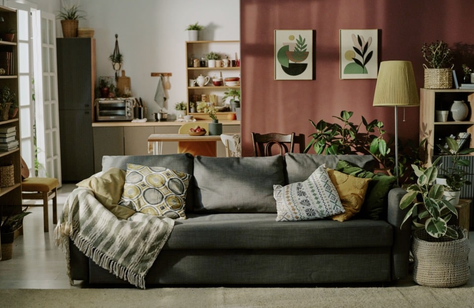
- dark and intensereds such as burgundy , aubergine, or Amarena by Vintage Prestige;
- sand and ochre in a relaxed and balanced palette, suitable for Mediterranean or boho-chic settings;
- powderpink or blush: a soft and romantic combination, ideal for cosy spaces or spring collections;
- intenseblacks, such as Graphite from Rio Verde ‘s new Evolution line, which emphasise the timeless elegance of Mocha Mousse;
- opaquegold or bronze: for metallic details that amplify the discreet glamour effect . In this case we can use Brown Gold and Yellow Gold from the line of Vintage Prestige metallic effect paints from Rio Verde.
