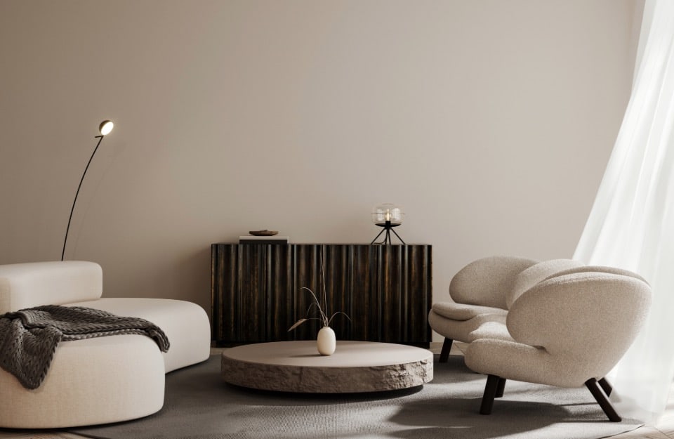
Warm, natural hues. Dusty or intense shades. Beiges and browns take the lead. The trend colours for 2025 in interior design do not present any great surprises. They appear more like a continuation and, in some cases, an evolution of what we have seen in recent years.
Comfort, cosiness and balance are the key concepts. But there is no shortage of unexpected colour touches.
- The advance of the ‘dessert browns’, the sweet browns
- The confirmation of terracotta, with pink-orange hues
- Butter yellow
- The moment of spicy yellows continues
- Reds with blue and violet undertones are among the trend colours of 2025
- For those who want to dare: pastel or electric shades of purple
- Pastel shades of pink
- Unusual shades of grey
- Deep, intense blues are among the trend colours for 2025
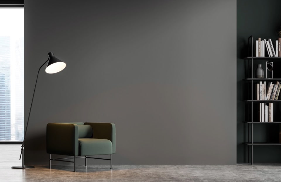
- Sage green again
- The freshness of teal
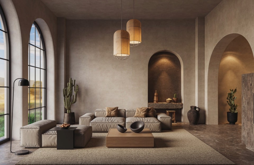
The advance of the ‘dessert browns’, the sweet browns
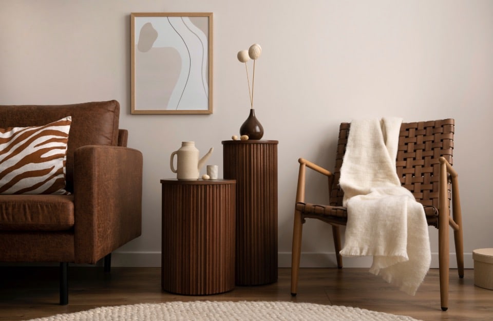
Warm neutrals – in the range of beiges and browns – have already been all the rage in interior design for a few years, mainly used as primary and secondary colours.
This trend is confirmed, however, veering towards shades reminiscent of sweets, on the wave of Mocha Mousse, elected colour of the year by Pantone.
From the deepest chocolate tones to honey; from caramel to hazelnut (which is part of Rio Verde’s Vintage Prestige palette, a textured paint for use on all surfaces), to a grey embellished with cinnamon shades, they evoke a sense of warmth and intimacy and are ideal for creating cosy atmospheres in living rooms, studies and dining rooms.
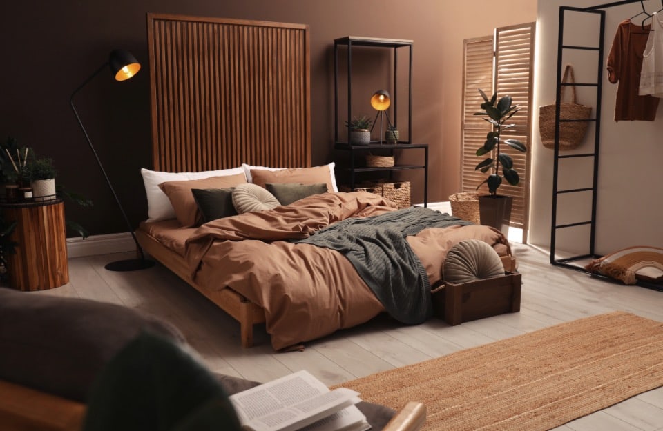
They can be combined with off-whites, terracotta, antique pink, sage green (the darkest browns) and deep blues (the lightest ones).
For metallic details: bronze, copper and rose gold, which can be found in Rio Verde’s Golden Prestige line of metallic effect paints.

The confirmation of terracotta, with pink-orange hues
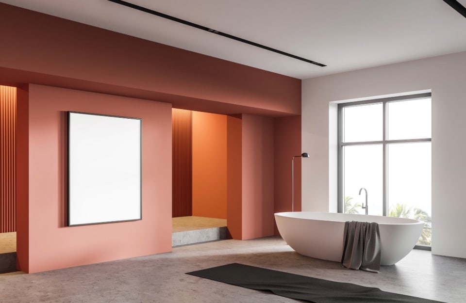
Clay and terracotta inspired shades are also the ‘new neutrals’ of 2025. In particular, terracotta shades with pink-orange undertones are emerging as protagonists, thanks to their ability to balance warmth and vibrancy.
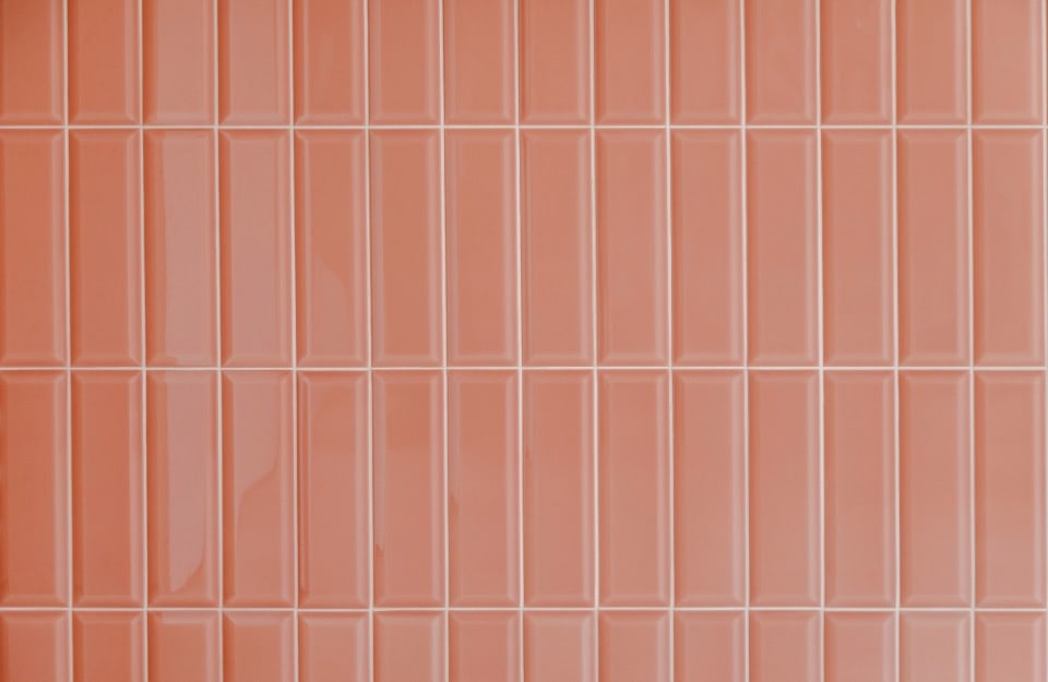
They match aqua green (recalling Moroccan landscapes), light and warm greys, natural materials such as wood, stone, rattan and linen fabrics. They are particularly suitable for rooms such as living rooms, bedrooms, entrances and bathrooms.
A variation on the theme isdesaturated orange, which is especially interesting for seating and accessories.
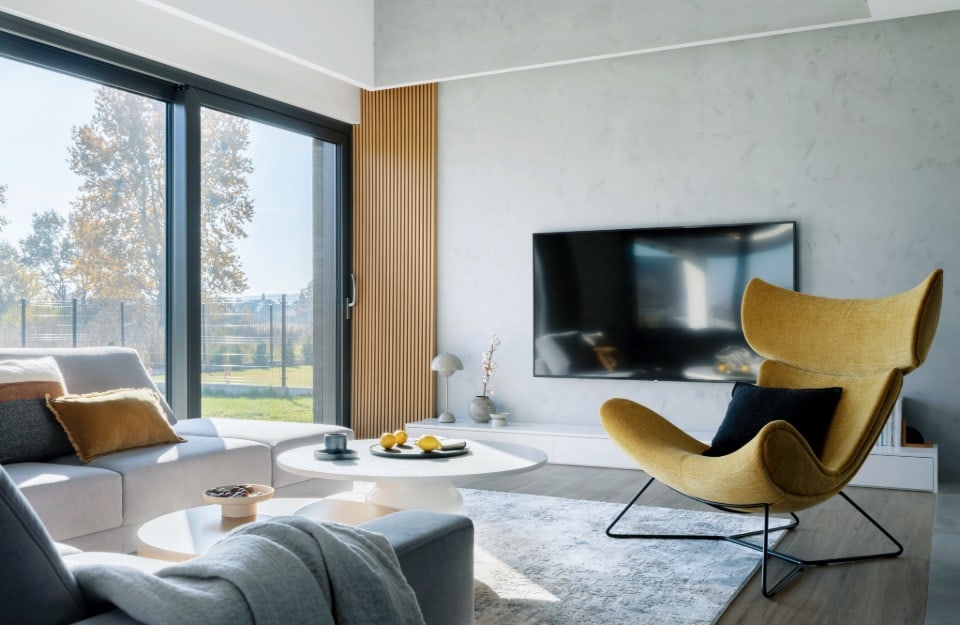
Butter yellow
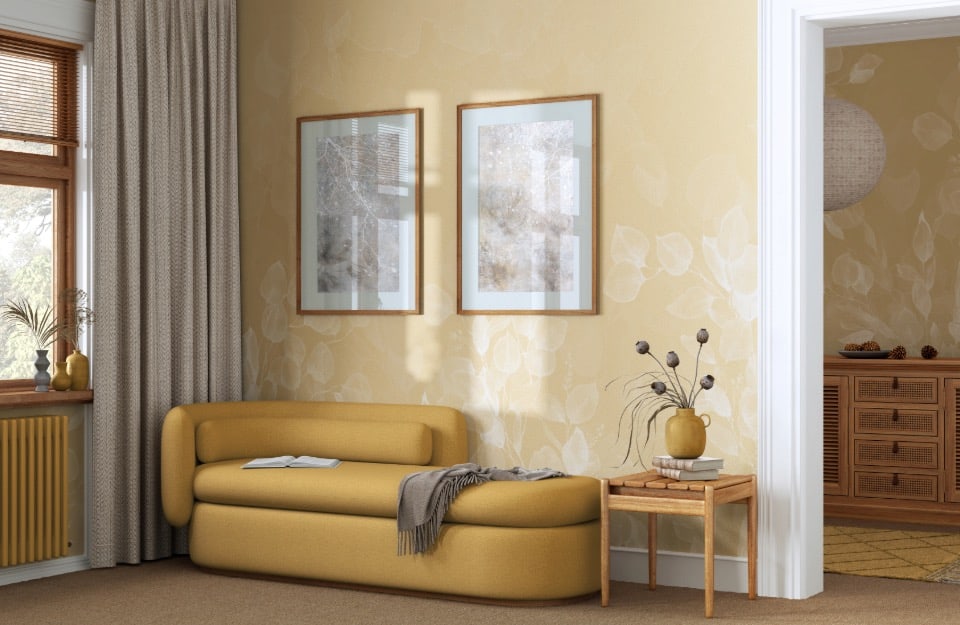
Muted yet sunny, butter yellow – similar to the suit worn by Sinner during his victory at the Australian Open 2025 – has already conquered the fashion world and will probably be one of the most interesting colours to try in our homes.
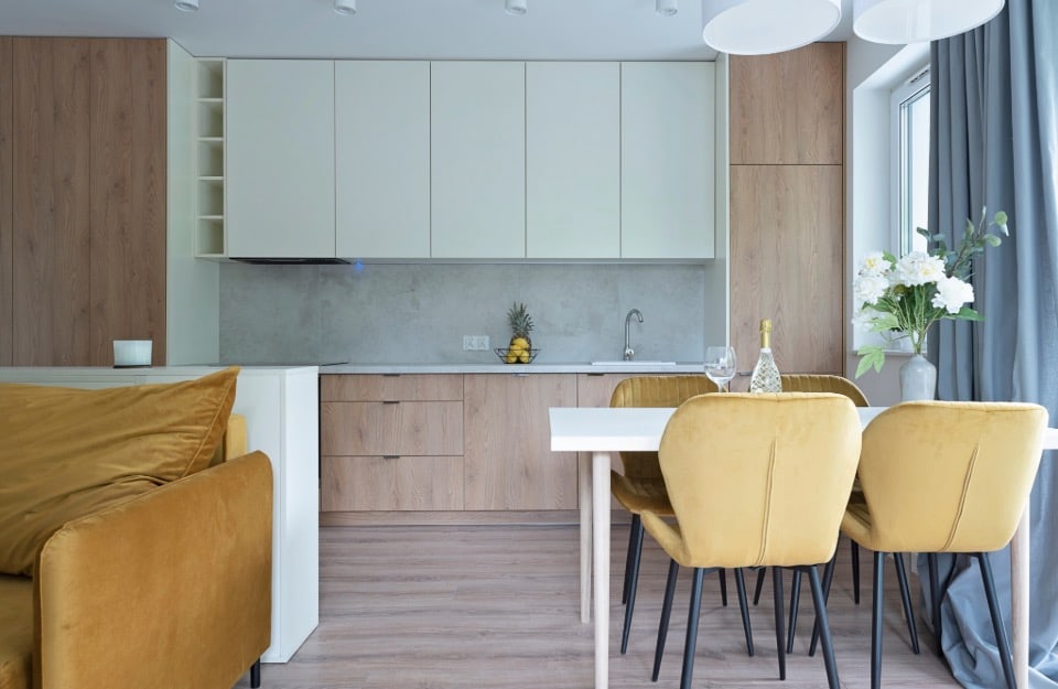
It goes well with the above-mentioned browns, warm whites, sage green, aqua green (for brightness) and, tone on tone, with the more intense and spicy yellows (more on these later).
It is especially suitable for living rooms, kitchens and small niches, as well as on furnishings such as sideboards, chairs, armchairs and sofas, and on accessories and complements such as carpets, curtains and objects.
We also suggest trying the vanilla variant, available among the ready-made colours of Rio Verde’s Vintage Prestige line.
The moment of spicy yellows continues
Spicy shades of yellow (which can turn to orange or brown) such as saffron, mustard,ochre, mustard, turmeric and solidago yellow continue to dominate the trends of 2025 due to their ability to convey energy and vitality. These colours not only brighten up spaces, but also bring an exotic and contemporary touch to interiors. Perfect for rooms with little natural light, they are ideal for decorative details, textiles or accent walls.
Recommended combinations: they go harmoniously with deep shades such as petrol blue, anthracite grey or dark green, but also with light woods and natural materials.
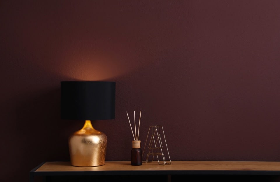
Reds with blue and violet hues are among the trend colours of 2025
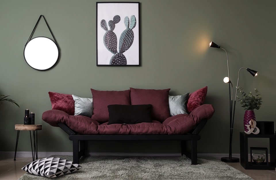
Sophisticated and intense shades such as cherry red, burgundy orblack cherry (found in the Vintage Prestige paint palette) represent a perfect balance of passion and sophistication. These colours, also in very dark shades and characterised by blue and purple or brown nuances, are ideal for adding depth and character to rooms.
Perfect for accent walls, sofa and armchair upholstery, or decorative details such as cushions and carpets. They can be combined with neutral shades such as cream and light grey, as well as luxurious materials such as velvet, brass and dark woods.
For those who want to be daring: pastel or electric shades of purple
Considered a ‘difficult’ colour for the domestic environment, purple in this 2025 winks at both the spiritual dimension and the digital and technological side in general.
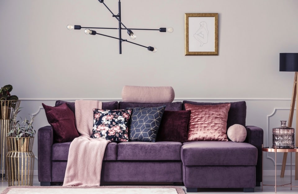
The shades we will see most are soft lilacs or, on the contrary, intense and electric purples, combined with black or greys, but also butter yellow.
Other variants: aubergine and plum.
The wave of pastel pink persists
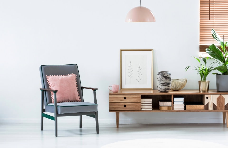
For several years now, with only a few variations, and driven mainly by the so-called ‘Instagram aesthetic’, pastel pink has unstoppably continued its conquest of the design world.
Delicate and dreamy, to be cleared through customs even outside bedrooms, this year it comes in different variants, from powdery to frappe (the latter is the top colour in Rio Verde’s Vintage Prestige palette) to warmer shades.
It goes perfectly with browns and beiges, butter yellow, teal, sage and in general with many intense blues and greens.
Unusual shades of grey
In the grey palette, always elegant and ductile, we find a warm, lunar white-grey with yellow-brown hues, a perfect neutral base for multiple combinations.
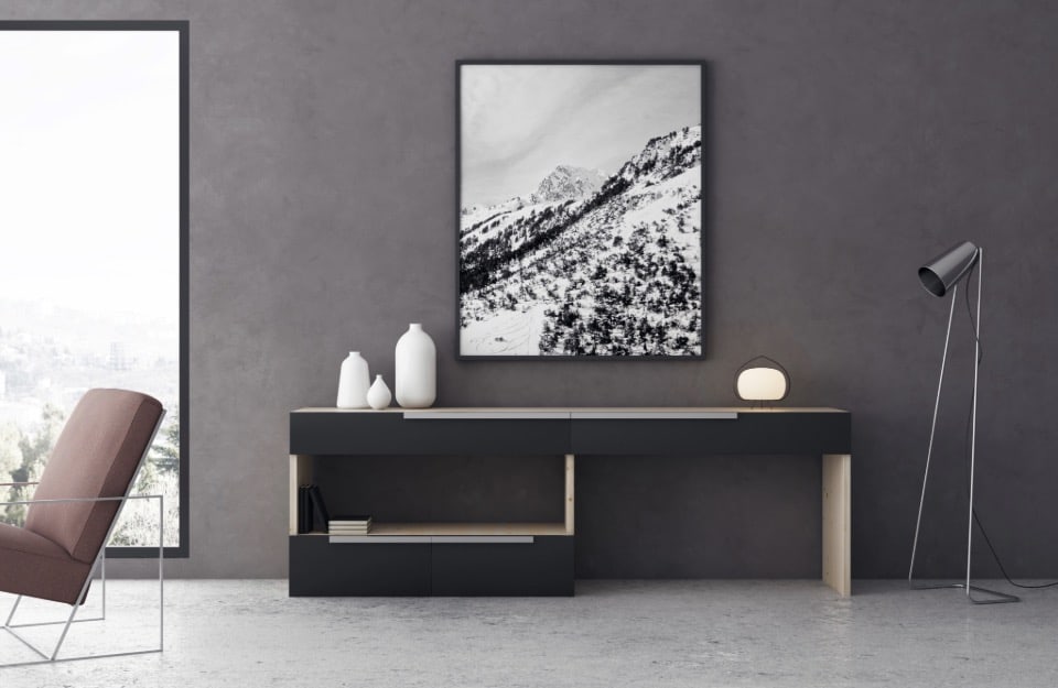
The classic slate grey, on the other hand, is renewed with subtle violet highlights, adding mystery and modernity. Ideal for home offices or bookcases, this colour creates sophisticated environments when combined with linear furniture and pendant lighting, especially in industrial or minimalist style settings.
To be combined with polished concrete and glass elements.
Finally, the truffle grey, a warm and cosy grey, which is also perfectly combinable with many of the most fashionable colours. It also features in the Vintage Prestige colour palette.
Among the trend colours for 2025 are deep, intense blues
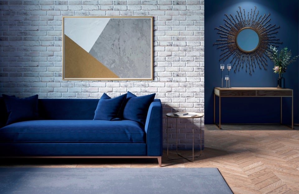
Vibrant colours such as cobalt blue or deep colours such as navy blue and even darker, almost ‘abyssal’ shades head the ranks of the most popular blues for contemporary interior design.
They match terracotta and light browns, natural wood, pastel pinks, burgundy and burgundy reds, yellows and greys.
Paired with shiny metals such as brass or gold, it creates a sophisticated and modern contrast, as well as with brushed steel.
More sage green
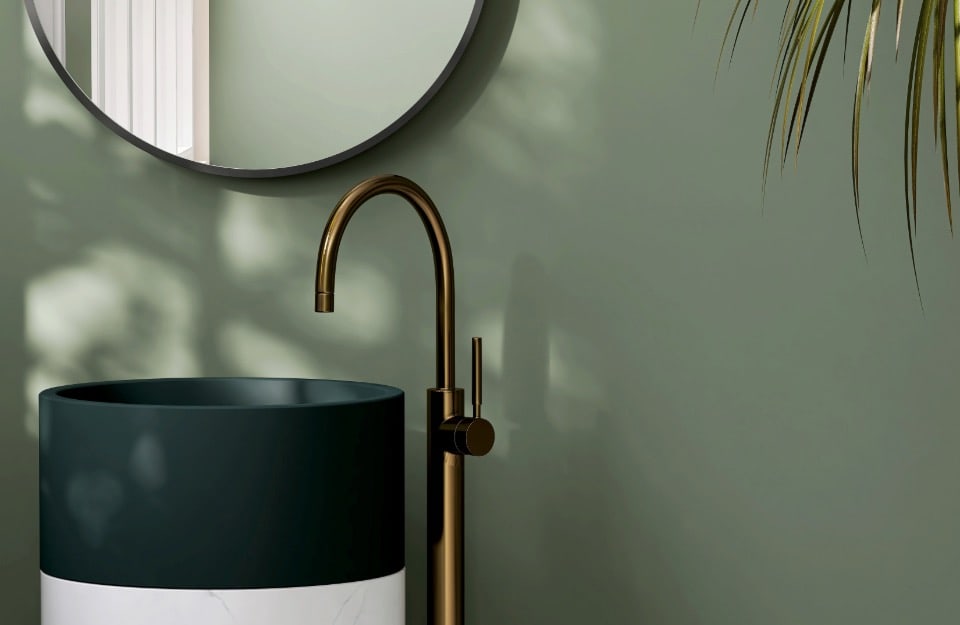
Warm and dusty, sage green continues its rise, thanks to its versatility and its reference to nature. This soft tone, reminiscent of the leaves of aromatic herbs, is perfect for those seeking a relaxing and rejuvenating atmosphere. It is particularly suitable for bedrooms and bathrooms, where it can be combined with materials such as marble and rattan for an elegant and natural effect.
The freshness of teal
Aqua green, or (more correctly) aquamarine, is one of this year’s brightest colours.
Perfect for bathrooms and wellness areas (but not only: it can also be dared in other rooms of the home), it goes well with white and light wood, but also with pastel pink, deep blues, beiges and the most fashionable browns, as well as with butter yellow.
